Introduction
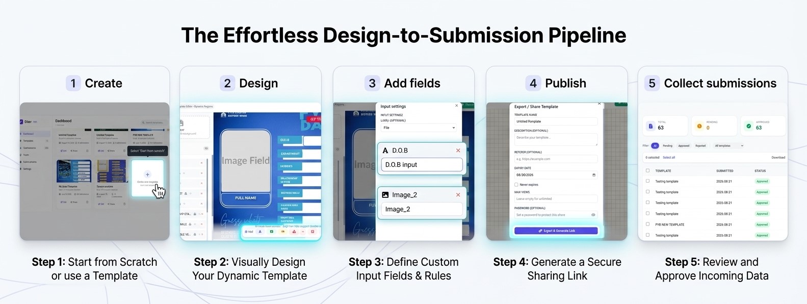
Diterr is a powerful design tool that lets you create dynamic flyers and forms. You can add text, images, shapes, and frames, then publish them as shareable templates that collect user submissions and automatically generate personalised images.
Key Features
- Drag‑and‑drop editor with smart alignment guides
- Dynamic form fields (labels, inputs, file uploads, etc.)
- Publish templates with secure share links
- Collect and manage submissions
- Auto‑generate filled flyer images
- Subscription plans with billing
How to get started
- Create a new template from the dashboard.
- Add and style elements on the canvas.
- Mark elements as form fields if needed.
- Publish your template to get a share link.
- Share the link and watch submissions come in.
Find your way around
If you are new to Diterr, it's normal to feel a bit overwhelmed by the editor's interface. Don't worry! We'll take you on a quick tour of the main sections of the editor, so you can get started with confidence.
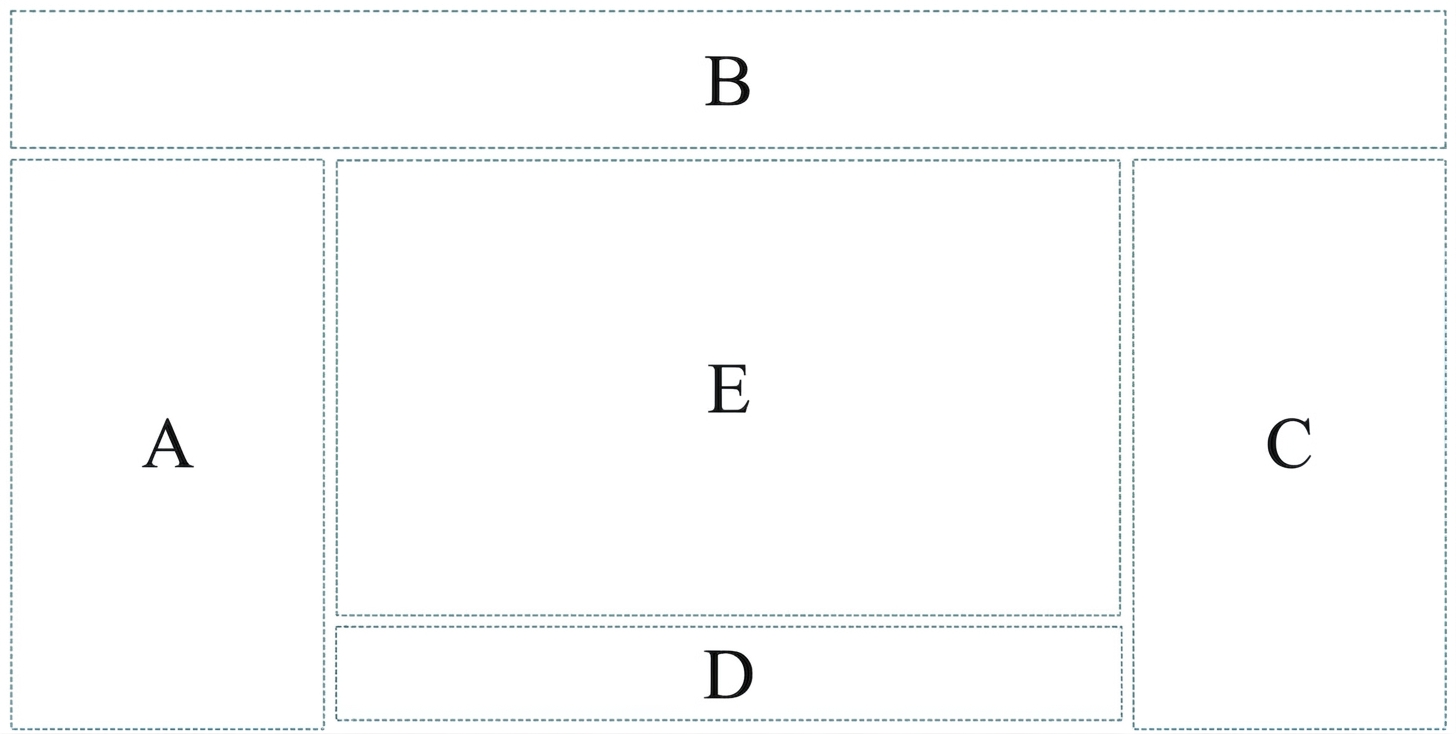
- A (Left Panel): Contains your design hierarchy & layers, lets you select, view, and delete elements; also includes the flyer upload box for background images.
- B (Top bar): Contains buttons to preview, publish and reset your design.
- C (Properties Panel): Contains options for editing selected element's font, size, color, alignment, z‑index, field settings, and more.
- D (Toolbar): Contains tools for adding and manipulating elements on the canvas.
- E (Canvas): The drag and drop area where you design your Template.
A. Left Panel
Layers & Template Upload
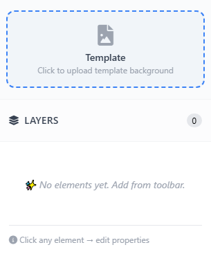
The Left Panel houses your design hierarchy and layers, letting you select, view, and delete elements. It also includes the Flyer upload box for adding background images to your canvas.
- Element hierarchy & nesting
- Layer selection & deletion
- Background image upload
The Layers panel puts you in complete control of your design's structure. At the top, the Flyer upload box lets you add a background image to your canvas with a single click. Below, a hierarchical list displays every element in your design—text, shapes, images, and frames—clearly showing parent-child relationships, such as elements nested inside a frame.
Click any layer to instantly select it on the canvas and reveal its properties in the right panel. Locked elements are marked with a lock icon, preventing unwanted edits, while hovering over any list item reveals a delete button for quick removal. The panel also shows your total layer count, giving you an at-a-glance view of your design's complexity.
If you want to learn more about the Left Panel features, check out the Editor Basics section below.
B. Top Bar

Preview, Publish & Reset
The Top Bar contains essential action buttons for managing your design workflow. Preview your template, publish it for sharing, or reset your canvas to start fresh.
- Real-time preview
- One-click publishing
- Reset canvas
The Top Bar is your command centre for managing the design lifecycle. The Preview button opens a live view of your template, showing exactly how it will appear to your audience. The Publish button generates a shareable link, making your template available for submissions—you'll be prompted to set a name, description, and optional sharing restrictions like password protection or expiry dates.
The Reset button clears all elements from your canvas, giving you a clean slate to start over. This is particularly useful when experimenting with different layouts. A confirmation dialog prevents accidental resets, so you can work with confidence.
For detailed publishing options, visit the Publishing & Sharing section.
C. Properties Panel
Styling & Field Settings
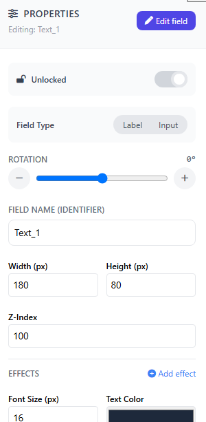
The Properties Panel gives you full control over any selected element. Adjust fonts, sizes, colours, alignment, z‑index, and form field settings.
- Font & size controls
- Colour & alignment
- Field type settings
The Properties Panel is where you bring your design to life. When you select any element on the canvas—whether text, shape, image, or frame—its available properties appear here. You can adjust font families, sizes, colours, and styles for text elements, or modify fill colours, borders, corner radii, and shadows for shapes and frames.
For form fields, this panel lets you set the field type (text, number, date, file upload, etc.), add validation rules, and configure options. You can also control alignment, padding, and z‑index to fine‑tune the position and layering of every element. The panel updates in real time, so you can see your changes instantly on the canvas.
For more styling tips, see the Styling section.
D. Toolbar

Add & Manipulate Elements
The Toolbar provides all the tools you need to add and manipulate elements on your canvas. Add text, images, shapes, frames, and alignment guides.
- Add text & images
- Insert shapes & frames
- Alignment guides
The Toolbar is your creative toolkit, positioned conveniently for quick access. Each button adds a new element to your canvas: Text for headlines and body copy, Image for graphics and photos, Shape for backgrounds and decorative elements, and Frame for creating containers that can hold and group other elements.
The Alignment Guide tool helps you keep your design neat by adding visual reference lines. Once added, all elements can be dragged, resized, and rotated directly on the canvas. The toolbar also includes options for duplicating elements (hold Alt while dragging) and deleting them (using the trash icon or Delete key).
For a detailed overview of all element types, visit the Elements section.
E. Canvas
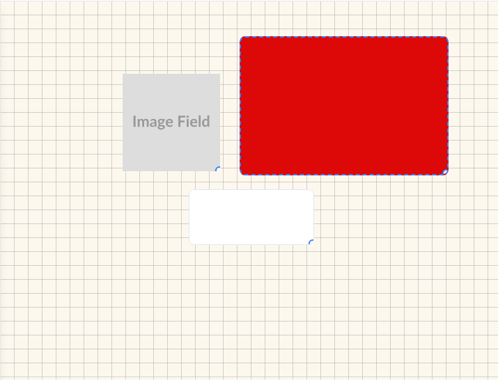
Drag & Drop Design Area
The Canvas is where your design comes to life. Drag and drop elements, reposition them freely, and build your template visually in real time.
- Drag‑and‑drop positioning
- Real‑time visual feedback
- Smart alignment guides
The Canvas is your primary workspace—a blank slate where you build your template exactly as you envision it. All elements added via the Toolbar appear here, ready to be positioned, scaled, and styled. You can drag any element to reposition it freely, or use the bottom‑right handle to resize it. The Canvas provides smart alignment guides that snap elements into place, helping you maintain clean, professional layouts.
Navigation on the Canvas is intuitive: hold Ctrl (or Cmd) and scroll to zoom in and out, or hold the Space bar and drag to pan around larger designs. Selected elements are clearly highlighted, and their properties appear instantly in the Properties Panel for quick adjustments. Every change you make is rendered in real time, so you always see exactly what your final template will look like.
For more tips on working with the Canvas, see the Editor Basics section.